The Board helps teams quickly assess the status of their work elements by showing their current stage, assigned owner, and the next actions required. This view is available for leads and deals, for Smart Object elements when the corresponding option is enabled, and is also used in Contacts and Companies for managing scheduled activities. For efficient day-to-day work, however, it is important that each card displays the information your team needs most often.
In Uspacy, you can customize the appearance of cards in Kanban and select which fields are displayed. For example, in addition to client information, deal amount, or responsible person, you can show the creation date, comments, or any other important details that help users quickly understand the context without opening the full element record.
This customization makes the board more informative, reduces the number of unnecessary clicks, and helps teams find the information they need more quickly while working.
How does it work?
Let’s look at card view customization using the Deals board as an example.
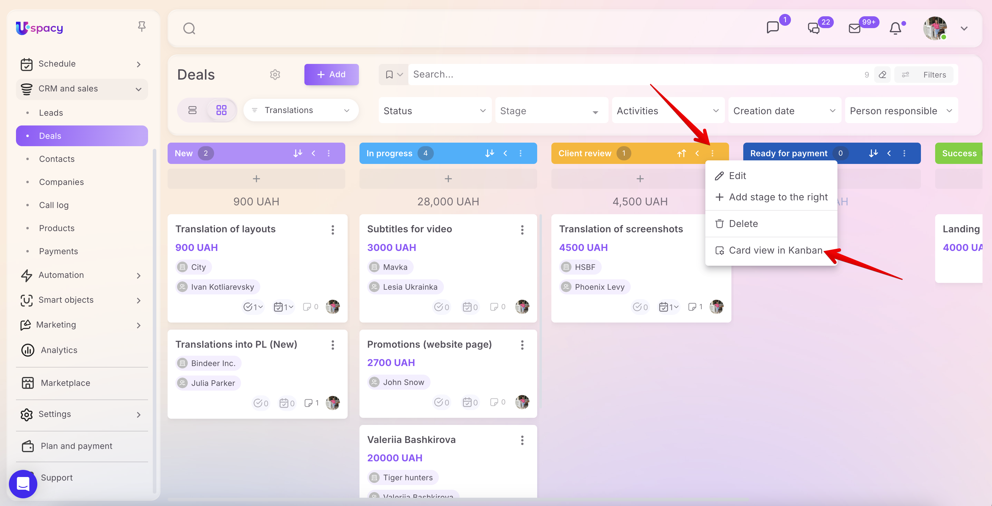
To access the settings, first switch to the board view. Then click the three-dot menu next to the name of the desired stage and select Card view in Kanban.
🌟 Please note: The ability to customize the card view on the board is available only with the Professional plan.
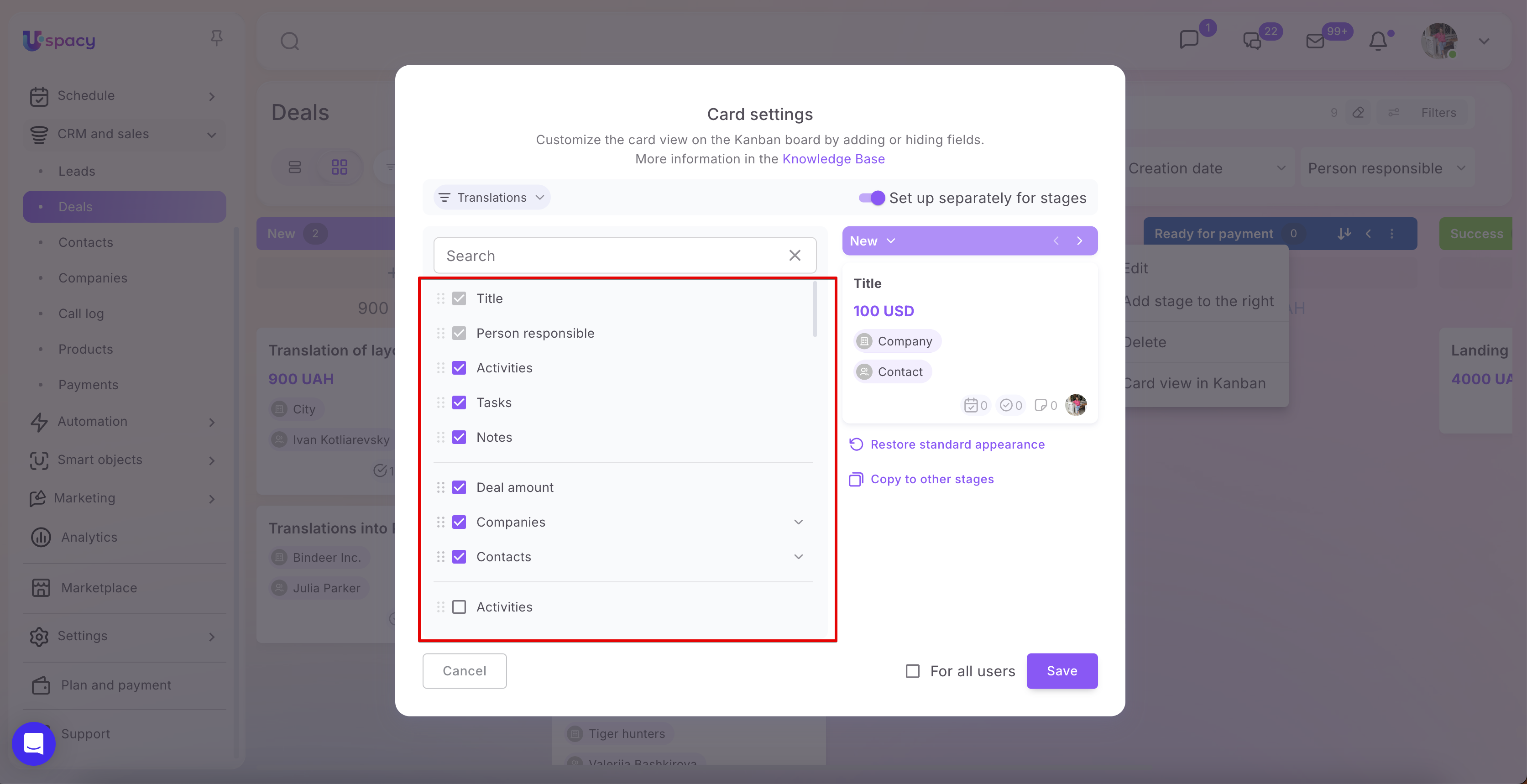
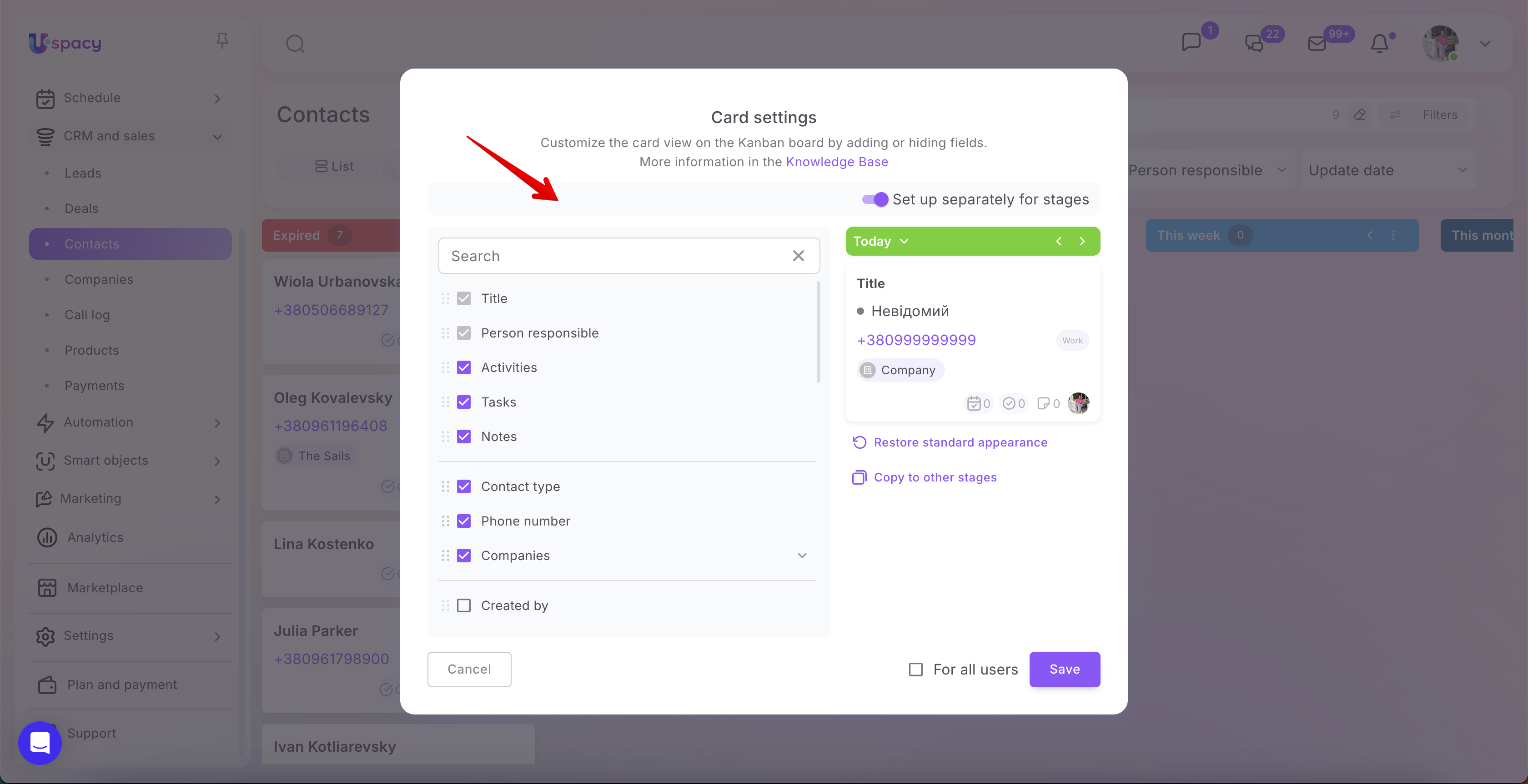
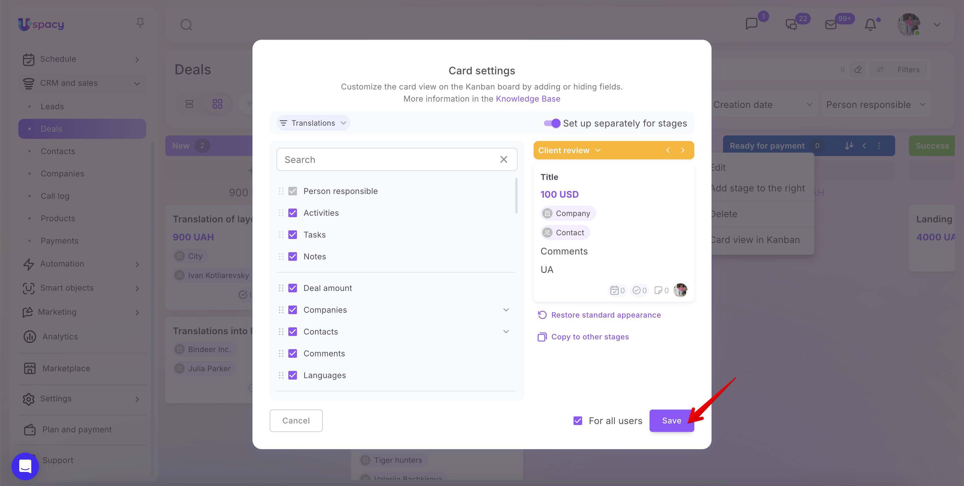
After that, the Card settings window will open. Here, you can define which fields will be displayed on element cards and which ones should be hidden. A live preview is shown on the right, allowing you to immediately see how the card will look after the changes are applied.
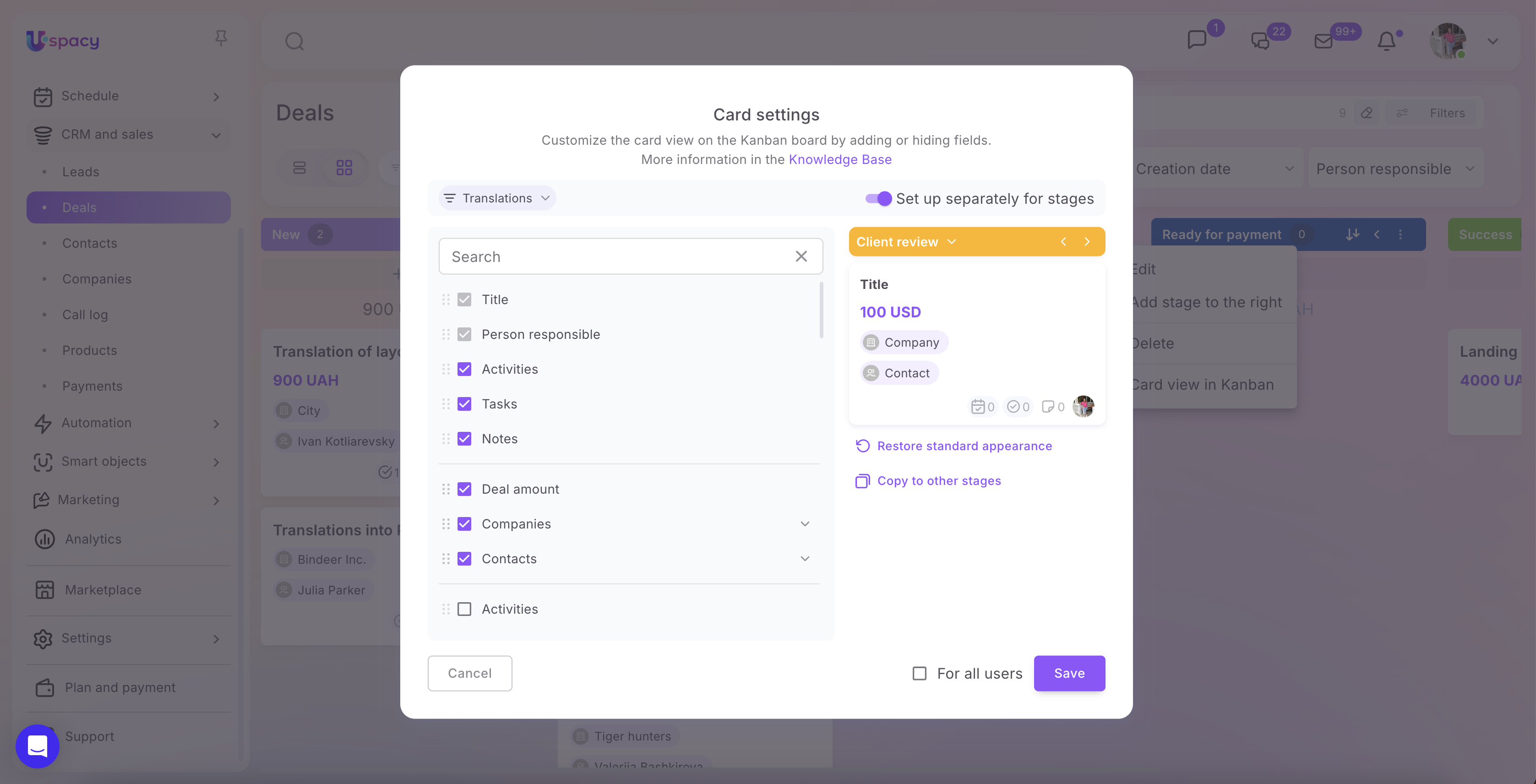
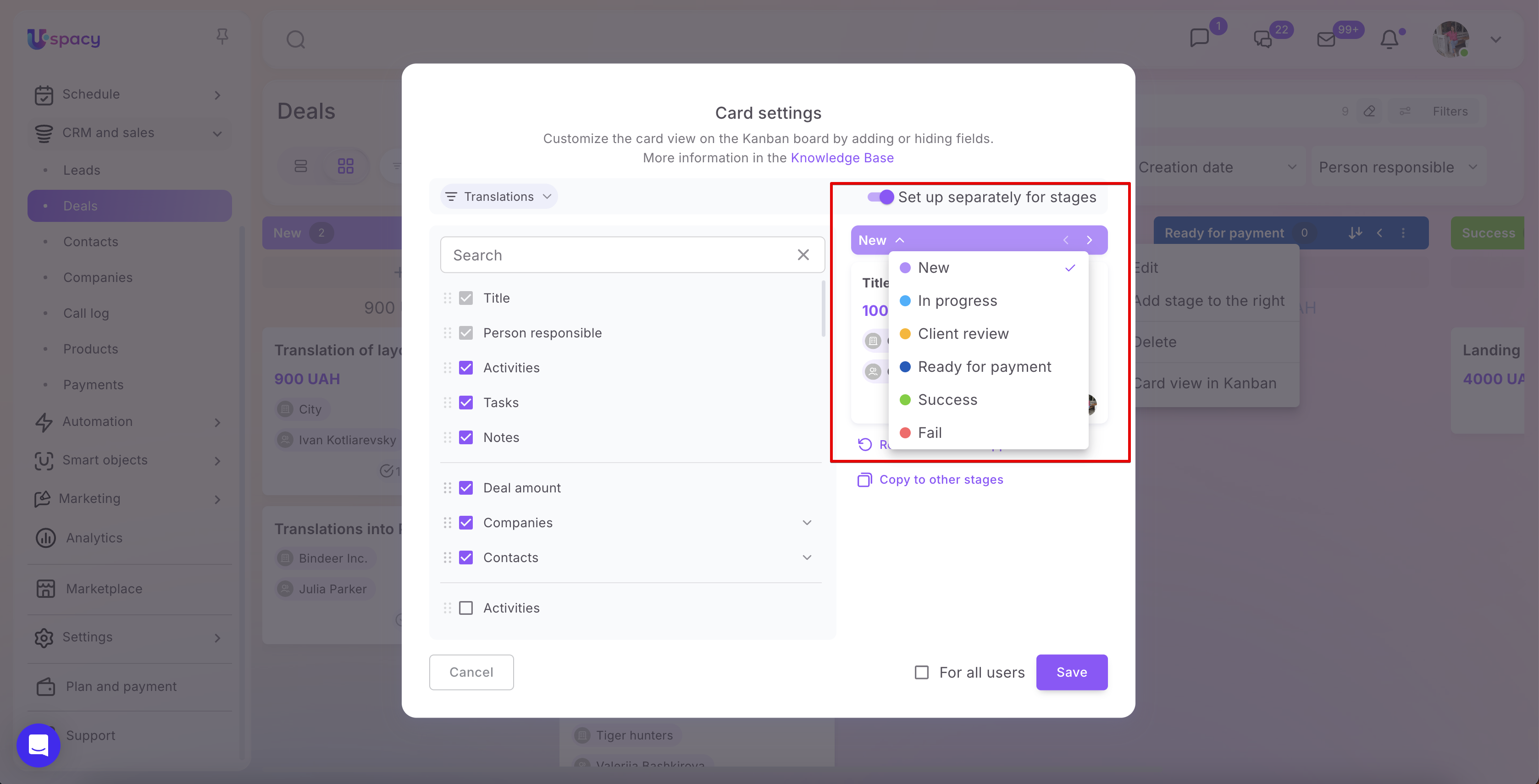
At the top of the window, you can select the funnel for which you want to configure the card view.
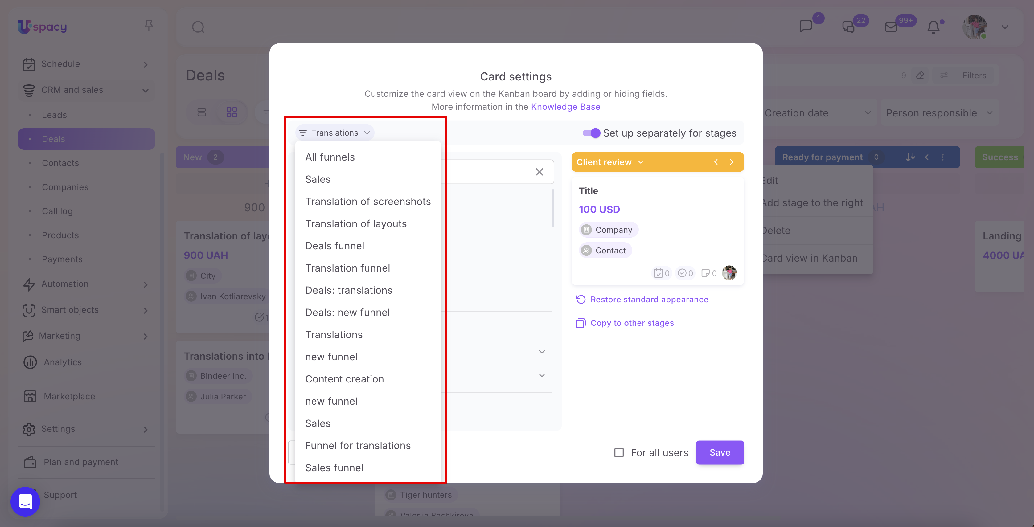
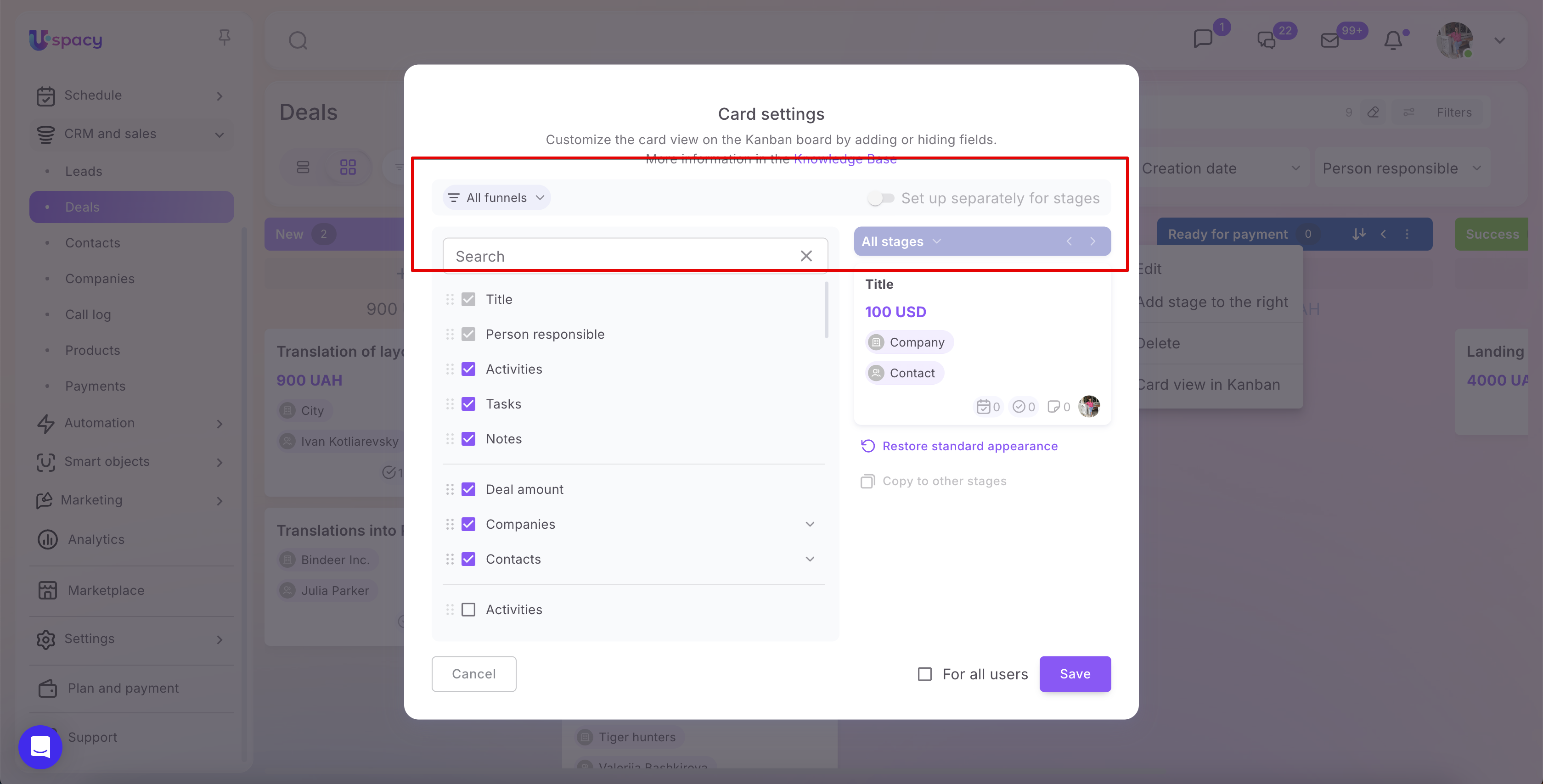
💡 You can also select the All funnels option. In this case, the configuration will be applied not to a specific funnel but to all funnels within the current section.
When All funnels is selected, the Set up separately for stages option is automatically disabled. This means that cards will have the same appearance across all stages in all funnels.
If you enable the Set up separately for stages option, the first funnel in the list will be selected automatically in the funnel field.
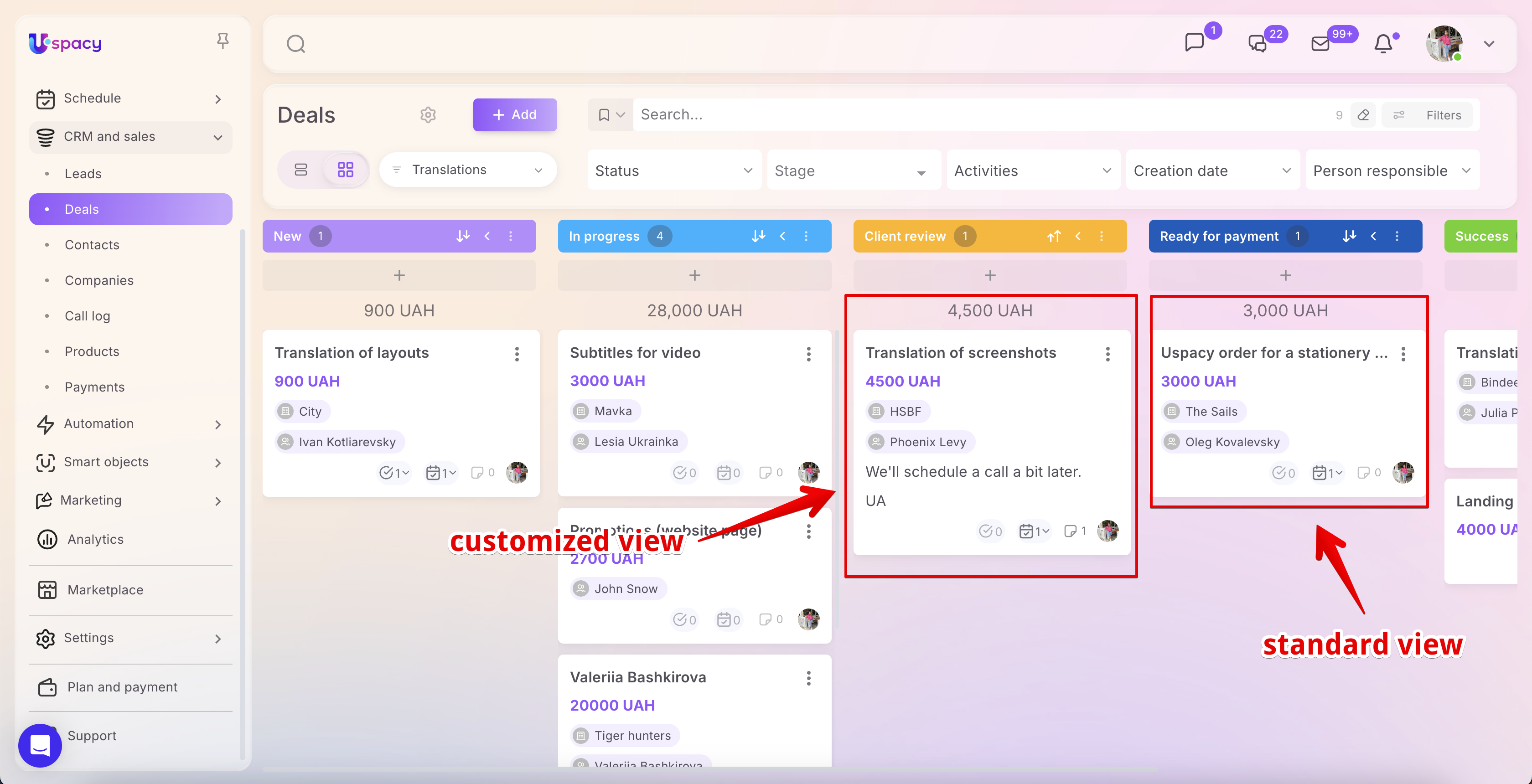
If different stages require different sets of information, enable the Set up separately for stages option. You can then select a specific stage from the list or navigate between stages using the arrow buttons.
The left side of the window displays a list of available fields. To show a field on the card, select its checkbox. To hide a field, clear the checkbox.
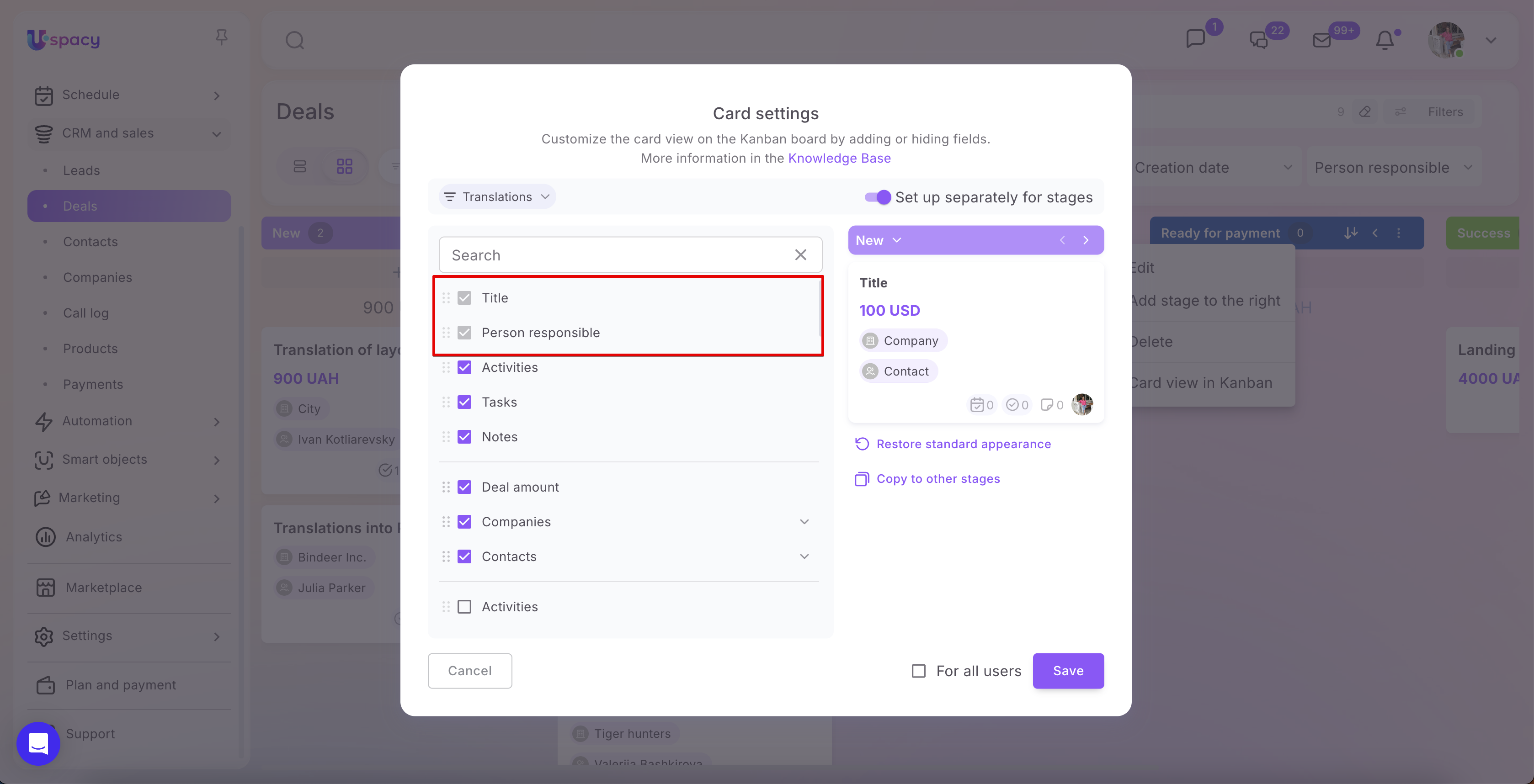
The Title and Person responsible fields are required and cannot be hidden or repositioned. They remain selected by default.
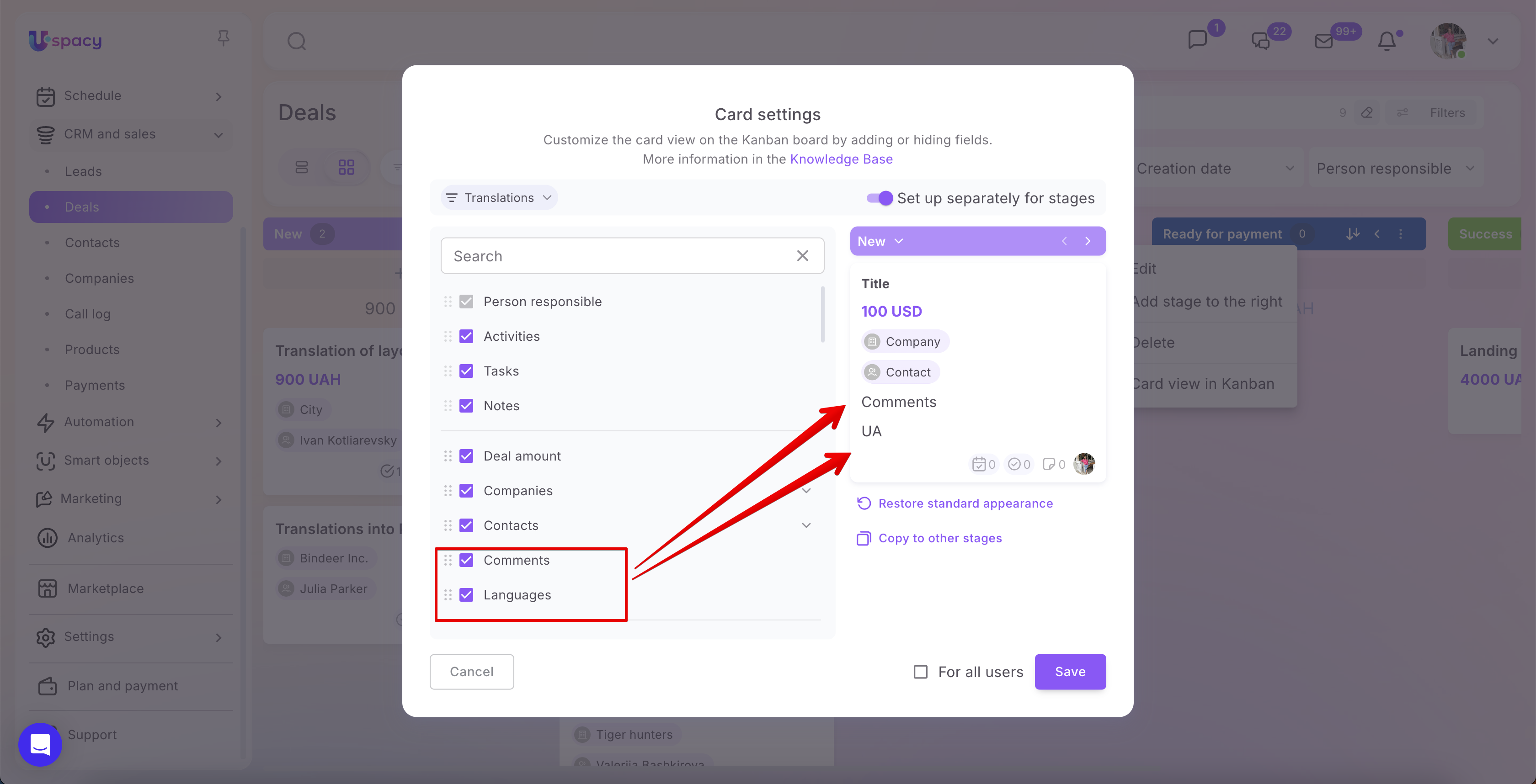
For example, if you add the Comments and Languages fields, they will immediately appear in the preview on the right. This allows you to verify whether the card displays enough information without having to open the full element record.
You can also change the order of fields if needed. Simply drag and drop a field to the desired position in the list. The information on the card will be displayed in the same order.
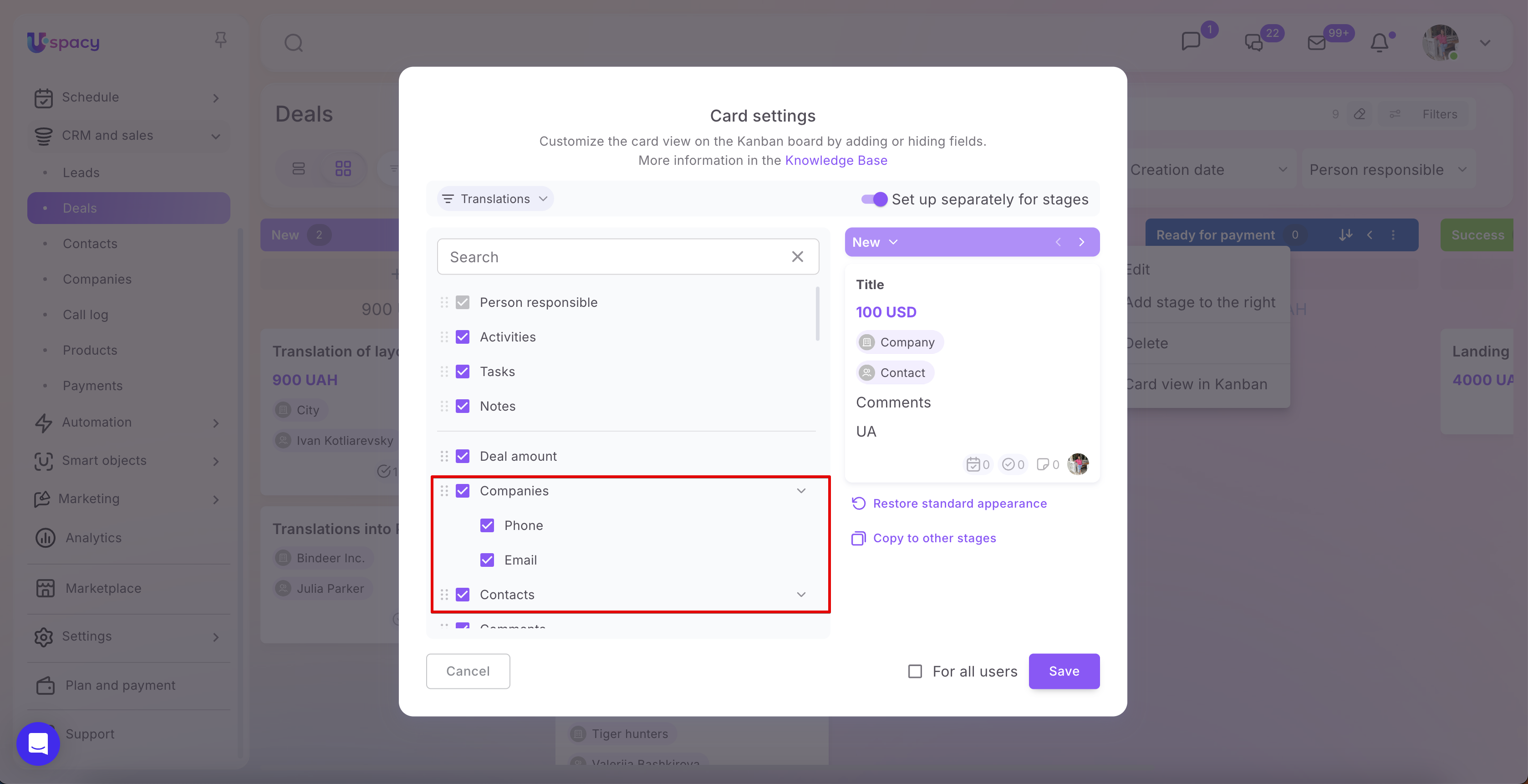
For the default fields linked to a Company or Contact, you can select whether to display their Phone number and Email address on the card. To do this, expand the corresponding field using the arrow icon and select the required subfields.
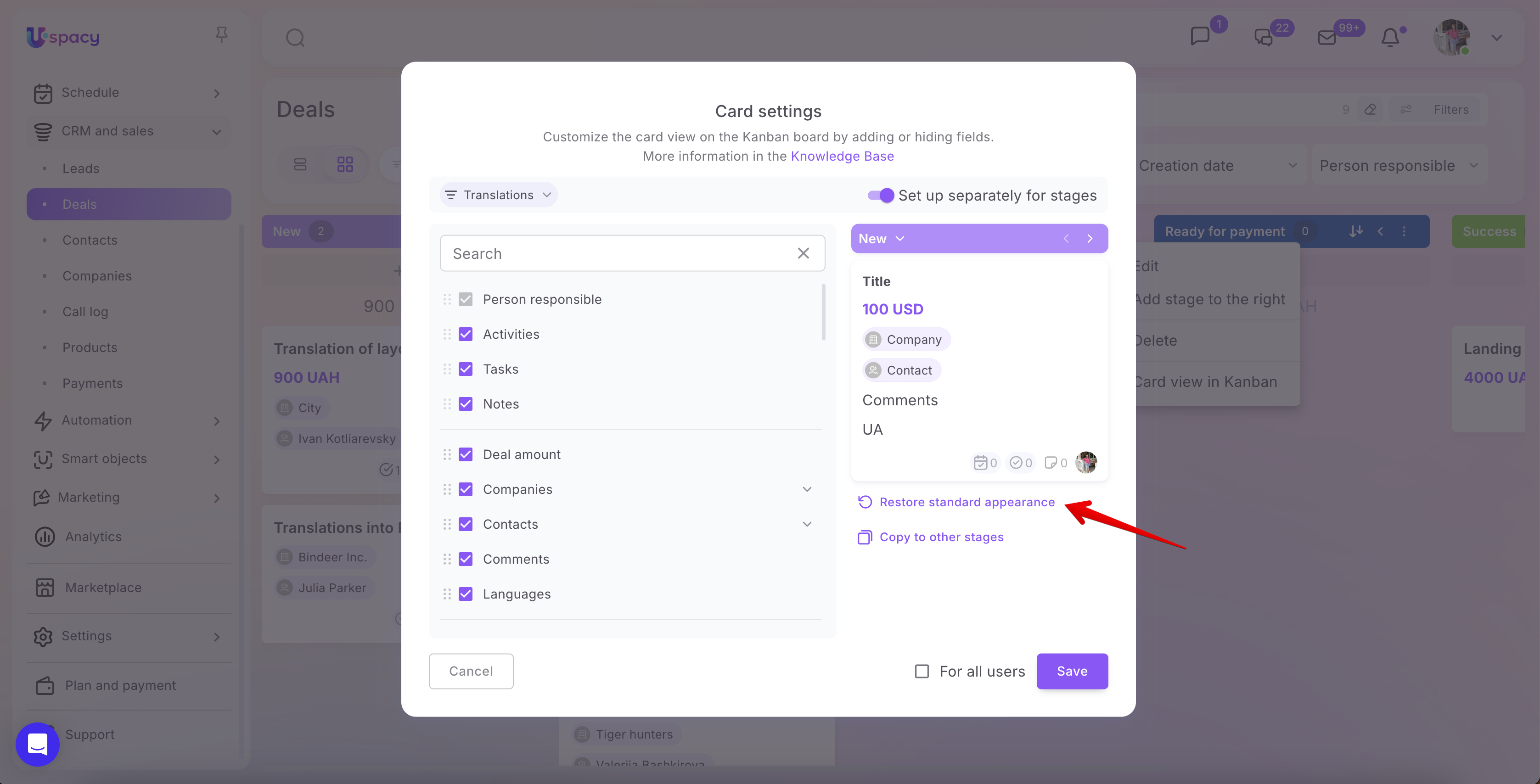
💡 If you want to restore the default set of fields, click Restore standard appearance. This will discard any changes and return the card to its standard layout.
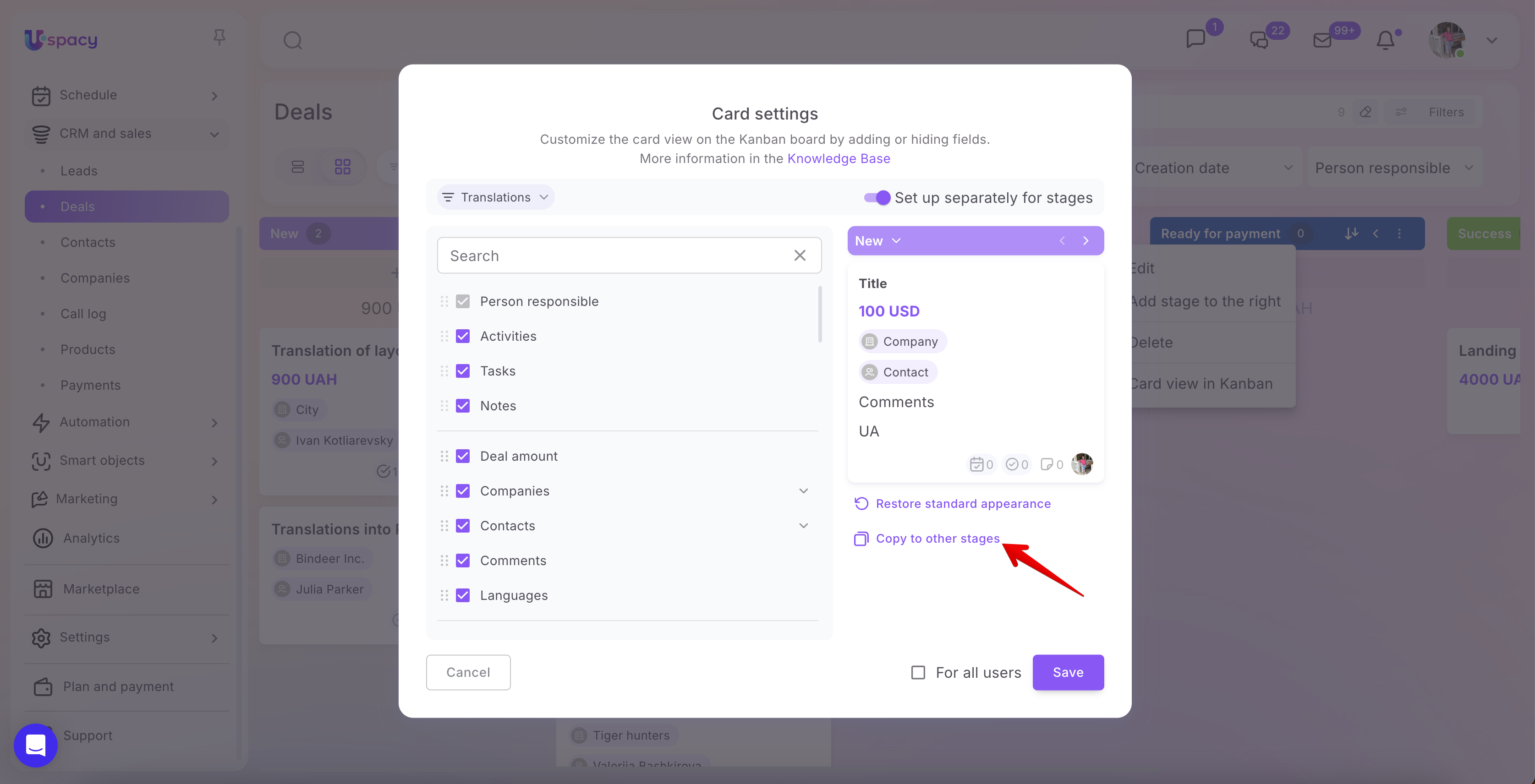
The Copy to other stages option is also available. This is useful if you have configured the card view for one stage and want to apply the same set of fields to other stages within the funnel.
Configuration details
🟣 Any Space user who has permissions to the relevant CRM or Smart Objects section can customize the card view. In our example, this is the Deals section. To do so, the user only needs to have at least view permissions for the elements.
Each user can tailor the card display on the board to their own workflow by selecting the fields they need, hiding unnecessary ones, and arranging the information in a convenient order. For example, one team member may only need to see the title, amount, and responsible person, while another may also want to display comments, related contacts, work language, or other custom fields.
At the same time, the Space administrator and owner can apply a unified card layout for all users. To do this, enable the For all users option. Once enabled, the card view on the board will be the same for everyone working in that section.
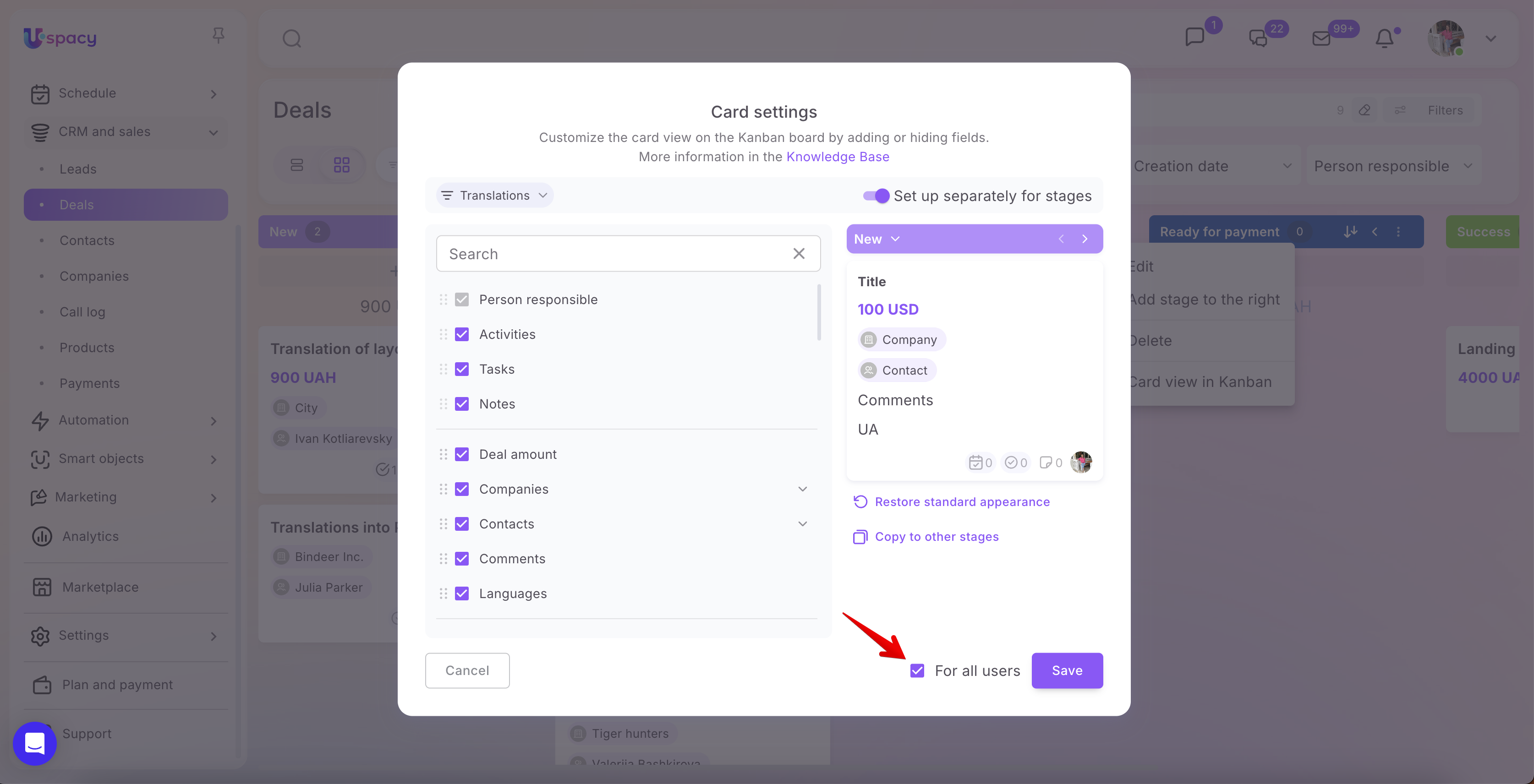
Even after an administrator or the Space owner applies a unified layout for all users, individual users can still customize the card view to suit their own preferences and workflow needs.
🟣 For Contacts and Companies, card view configuration follows the same principle. However, there is no need to select a funnel in these sections, as funnels are not used there. Instead, board stages are organized based on the time periods for which activities related to contacts or companies are scheduled.
To apply your changes, click Save.
After saving, cards on the board will be displayed according to the selected settings. For example, one stage can show extended information with additional fields, while another can retain the default layout with only the most essential details.
Customizing the card view on the board helps make working with elements faster and more convenient. Users can see important information directly on the card without opening the full record, while unnecessary fields can be hidden.
As a result, the board becomes more informative, and working with deals, leads, contacts, companies, or Smart Object elements can be better aligned with the team’s actual business processes.
If you have additional questions or you need to contact the support, send a request to this email [email protected]
Created: June 23, 2026 / Updated: June 26, 2026